You’ve seen the bright yellow vans sporting a red logo scooting between pick-up and delivery destinations across Australia. Those yellow vehicles have represented the CouriersPlease business for many of its 40 years.
Now though there’s an exciting change afoot as the heritage firm takes on a fresh look.
Richard Thame, appointed CEO back in early 2022, recognised the need for a bold new livery that would take the Aussie-born business to the next level and position it as a global provider.
“As the business approached its 40th anniversary this year, it was the perfect time to look afresh at the brand and what it represents to today’s customers, and franchisees.
“We saw a brand refresh as an opportunity to mark an exciting time for the company as it paves the way for global expansion and continued sustainability initiatives.”
Lissa Becker heads up marketing at CouriersPlease and she has led the brand overhaul. She says the goal was to give CouriersPlease a distinctive, contemporary identity and to align the presentation standards of vans in the fleet which will reinvigorate pride in the brand.
CouriersPlease new livery cuts costs for franchisees
There are economic and sustainability benefits too. Cutting back the significant costs of van signage would remove a barrier to entry and allow more franchisees to join the network.
Previously franchisees paid between $5,000 and $6,000 for a standard van wrap. Branding the average van now costs less than $1,000.
“This is a huge benefit for incoming franchise partners,” says Lissa.
The slick van livery also delivers environmental benefits in line with CouriersPlease’s sustainability mission. Now there is no need to wrap the 800+ vans in the fleet, the firm has significantly reduced its use of plastic.
Every day more than 800 franchise partners connect businesses and consumers through parcel deliveries. A CouriersPlease van is effectively the brand’s mobile billboard.
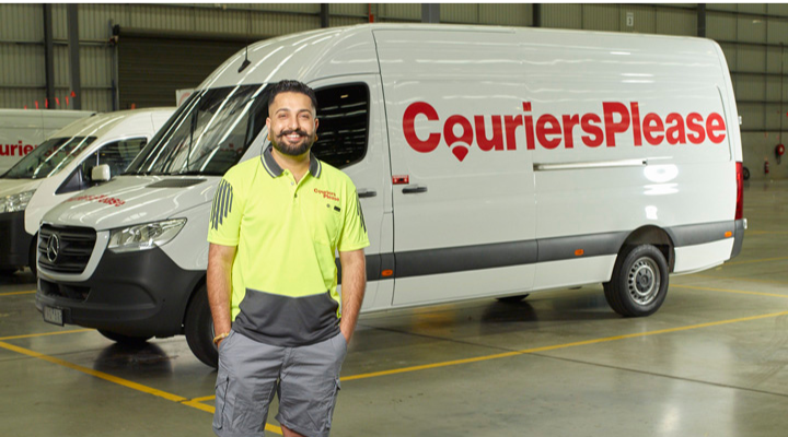
The old van wrap included a depiction of a map of Australia. It’s an image that no longer represents the international reach the courier firm enjoys.
Now there’s a clean white background with a sophisticated rendition of the CouriersPlease name in an eye-catching red logo. This new logo includes an icon of the location pin used with digital maps, the ‘O’ shown as a head-and-shoulders outline to convey the brand’s people-focused culture.
“We wanted bold and impactful. The red logo works both for continuity and because it’s a powerful retail colour,” says Lissa.
Bold new look elevates CouriersPlease
The slick red and white combination elevates the brand, and pitches it into the same design realm as iconic brands like Qantas, Virgin and Netflix.
“This new branding is very exciting; we’ve just done some videos and photo shoots, and started the van rebrand rollout,” says Lissa.
The rollout is in consultation with CourierPlease’s franchisee body, the Franchise Advisory Council. This ensures implementation is both efficient and cost effective for everyone involved.
The van rebranding is the job of the appointed signage company which sends a team to CouriersPlease depots.
“We are pretty much on the threshold of peak season so we are trying to rebrand as many as we can early morning and weekends if possible,” explains Lissa. ‘We’re so busy, parcel volumes are already up 25 per cent this quarter compared to last year, and we haven’t yet hit the Christmas peak.”
With franchise partners prepped and ready for another bumper season of festive deliveries, CouriersPlease will halt the rebranding rollout over the peak season. It will restart the implementation in the new year.
From van livery to smart uniform
For incoming franchisees, the van livery is a simple part of the onboarding process.
“New franchise partners buy a white van from our list of approved models, then we arrange to have them booked in for the van branding,” says Lissa.
The CouriersPlease rebrand of course extends right through the company’s visual assets. It isn’t just the frontline couriers who will be driving, and sporting the new livery; they have a smart new polo shirt that matches the modern mood of the transformed brand.
“There is legacy material that has to be changed. From every single invoice to satchels, to safety collateral through to social media tiles and digital ads and our updated website.
“Our new branding also includes a sunset gradient that we’re using in soft assets and business cards that adds dimension and warmth,” Lissa explains.
New CouriersPlease depots will sport the fresh new look
“Our agency, The Marketing Bungalow, took the project way beyond the logo. They’ve looked at what lies beyond that, the subliminal communications of the brand.”
It will be next year before CouriersPlease buildings sport the elegant new signage. The new green star rated depots will be first to showcase it when they open in 2024.
Sydney’s Greystanes depot is under construction, amalgamating the sites at Rosehill and Milperra in a space that is 28,644sqm and delivers the efficiencies of consolidating two depots into one.
In Victoria, the Mulgrave depot will move to a new site in Dandenong South, while the Perth Airport depot shifts to Hazelmere in the city’s suburbs.
It’s full steam ahead for the business that’s made logistics easy, all packaged up in a sparkling new look.
“We’ve had good feedback from franchise partners, customers, and colleagues,” says Lissa. “The new branding achieves just what we want, it clearly delineates our business, and it really stands out.”